SimpleBLE
Website Glow-Up in 3 weeks: Transforming open-source messaging into commercial-ready SaaS driving enterprise adoption.
SimpleBLE redesigned its website to transform from an open-source library into a commercial-ready product. The redesign introduced problem-focused messaging, clear social proof, and a structured validation path.
The challenge
SimpleBLE's website had solid traffic but terrible conversion. Developers were landing on the site, getting confused, and leaving without understanding the product's value.
The problems:
- Generic hero messaging that didn't differentiate or communicate time-saving benefits
- Feature-first structure, technical specs before establishing why anyone should care
- Social proof buried mid-page with no context
- Ambiguous conversion path, visitors couldn't figure out when they needed to buy or what they'd get
What we did
Before and after

Discovery Workshop
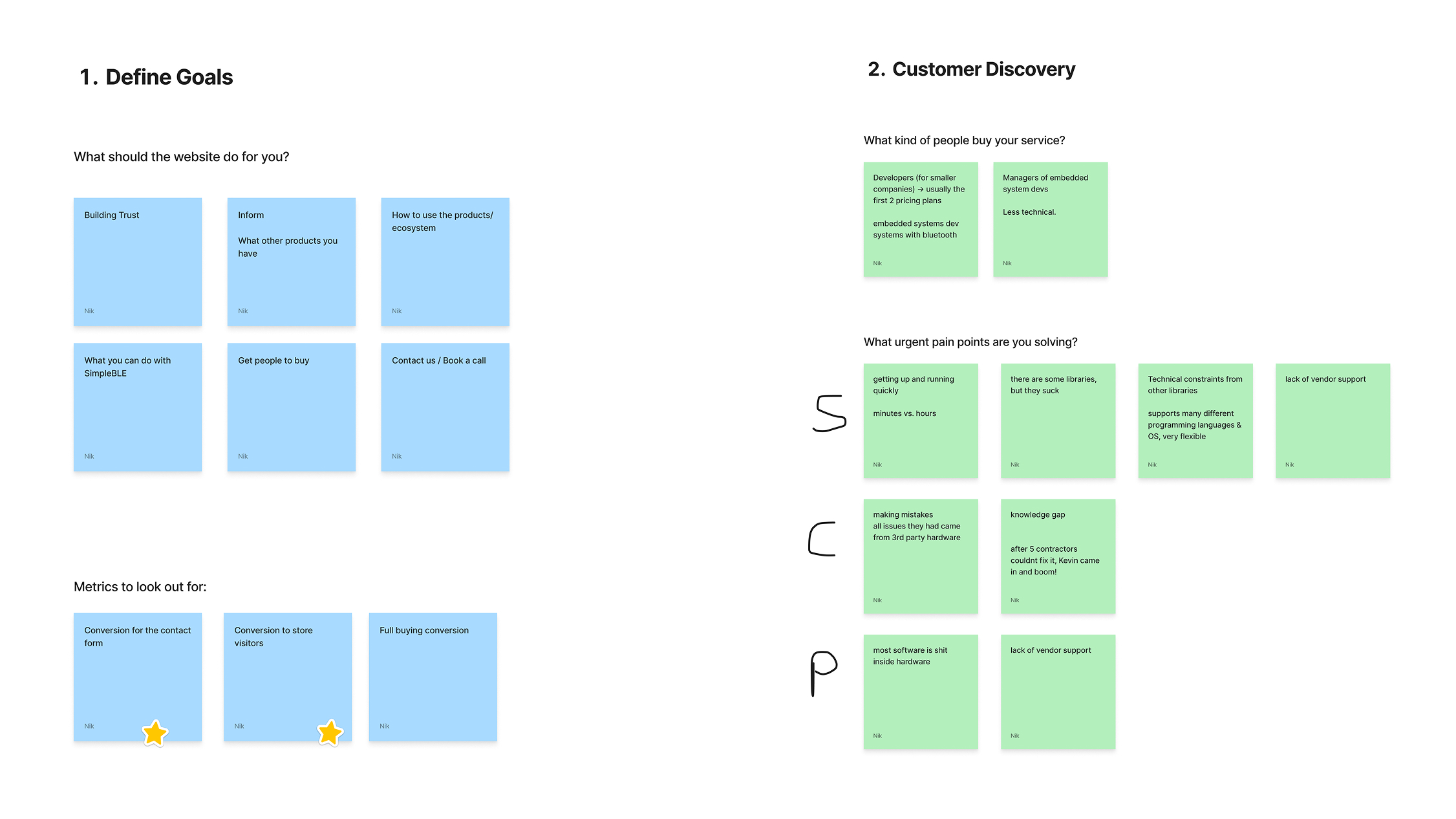
We began with a comprehensive discovery workshop to align on strategy before any design work began. This collaborative session established the foundation for all subsequent decisions.
Goals and Metrics
We defined six website objectives, from building trust to driving purchases,then prioritized the metrics that mattered: contact form conversions and pricing page traffic as leading indicators of commercial intent.
Costumer Discovery
Working with the SimpleBLE team's existing customer knowledge and analytics, we identified two distinct buyers: technical developers at smaller companies and non-technical managers at larger firms. Both needed different things from the site.
The Breakthrough
Customers weren't comparing features, they were comparing time wasted. They'd burned weeks on unreliable libraries that failed in production. Speed of integration ("minutes vs. hours") beat every other consideration, including price.
This single insight gave us the "minutes, not months" positioning that transformed the entire site. The message wrote itself once we knew what customers actually cared about.
Wireframes
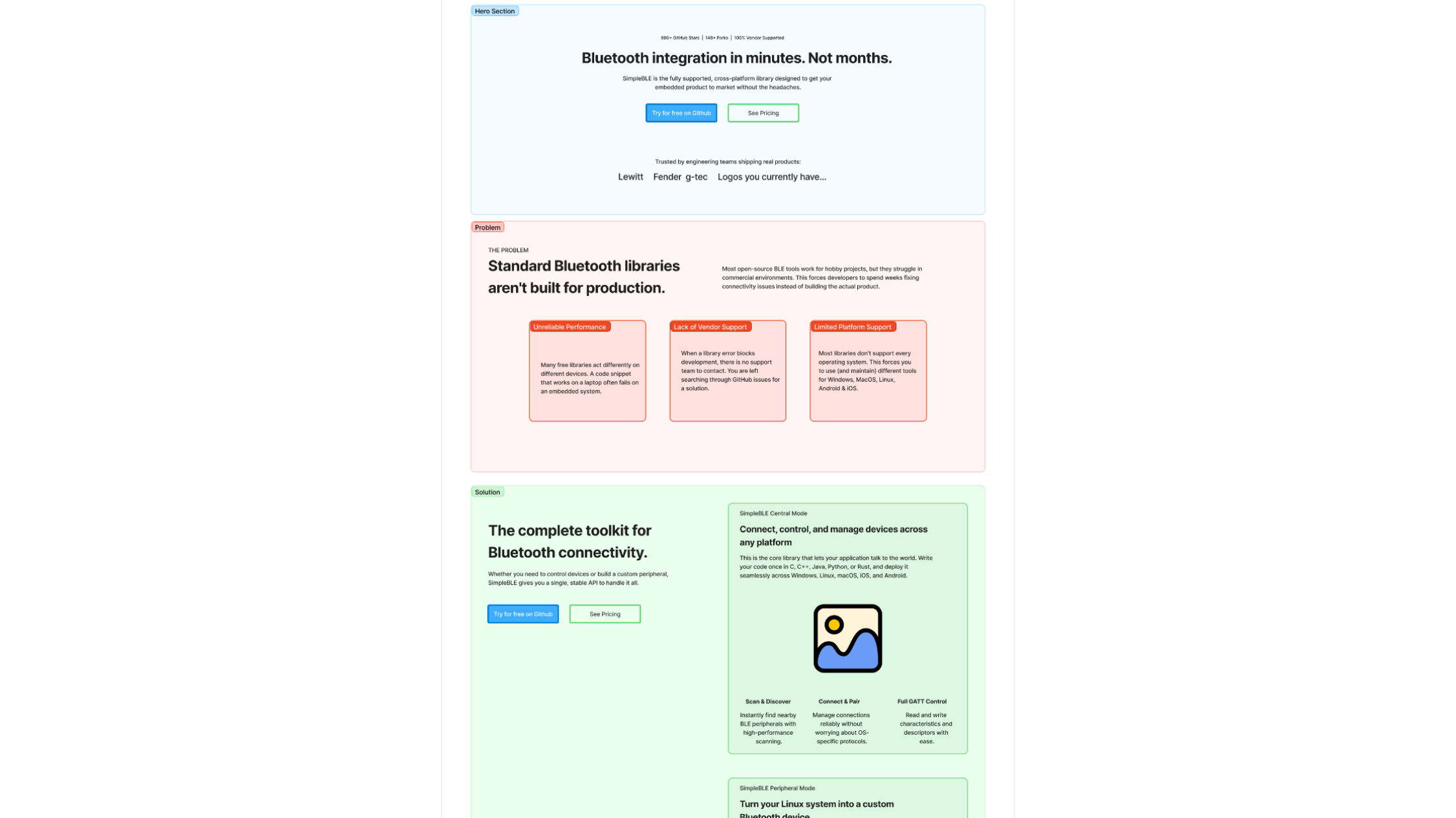
Based on workshop insights, we developed wireframes to structure the new site architecture and content hierarchy before moving to visual design.
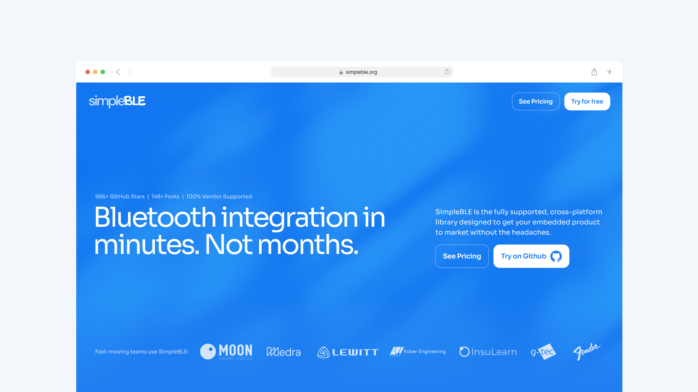
Repositioned the value Proposition
The hero section now leads with "Bluetooth integration in minutes. Not months," quantifying time savings with clear contrast. Supporting metrics appear immediately: "986+ GitHub Stars | 148+ Forks | 100% Vendor Supported."
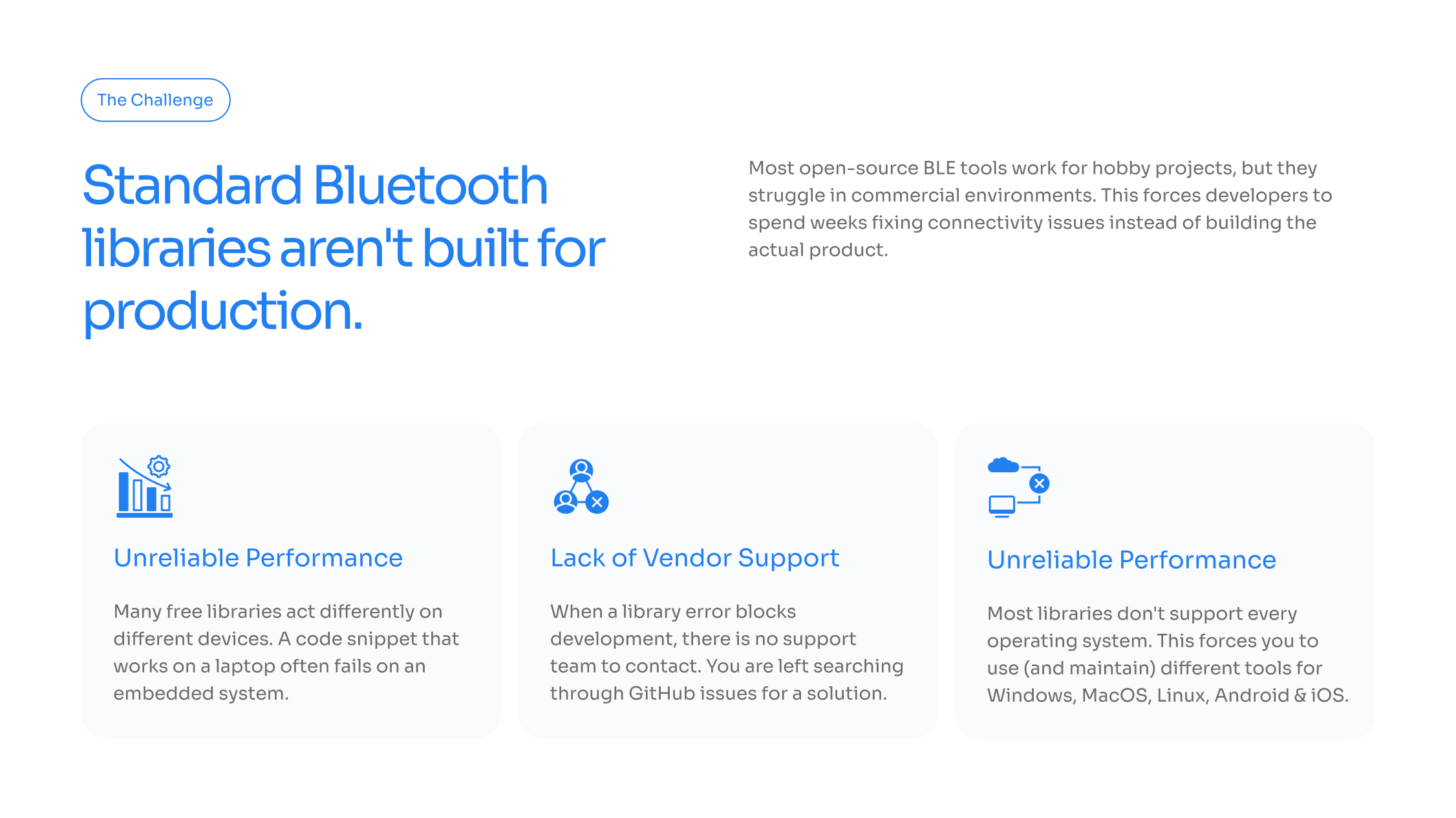
Added a Problem-Focused Section
A new "The Challenge" section explicitly names three pain points:
- Unreliable Performance: Inconsistent behavior across devices
- Lack of Vendor Support: No team to contact when errors block development
- Limited Platform Support: Maintaining separate implementations for each OS
Introduced Clear Validation Path
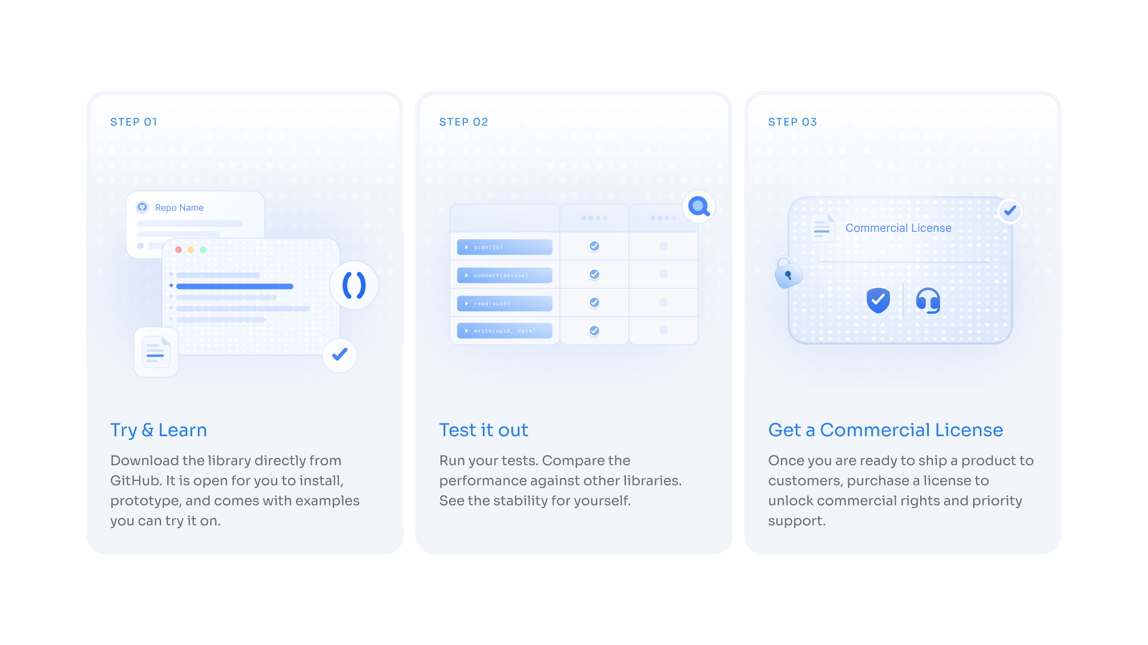
A "How It Works" section provides three steps with the headline "Validate the tech before you spend a dollar":
Step 01: Download from GitHub and experiment with examples
Step 02: Run tests and compare performance against other libraries
Step 03: Purchase a commercial license when ready to ship
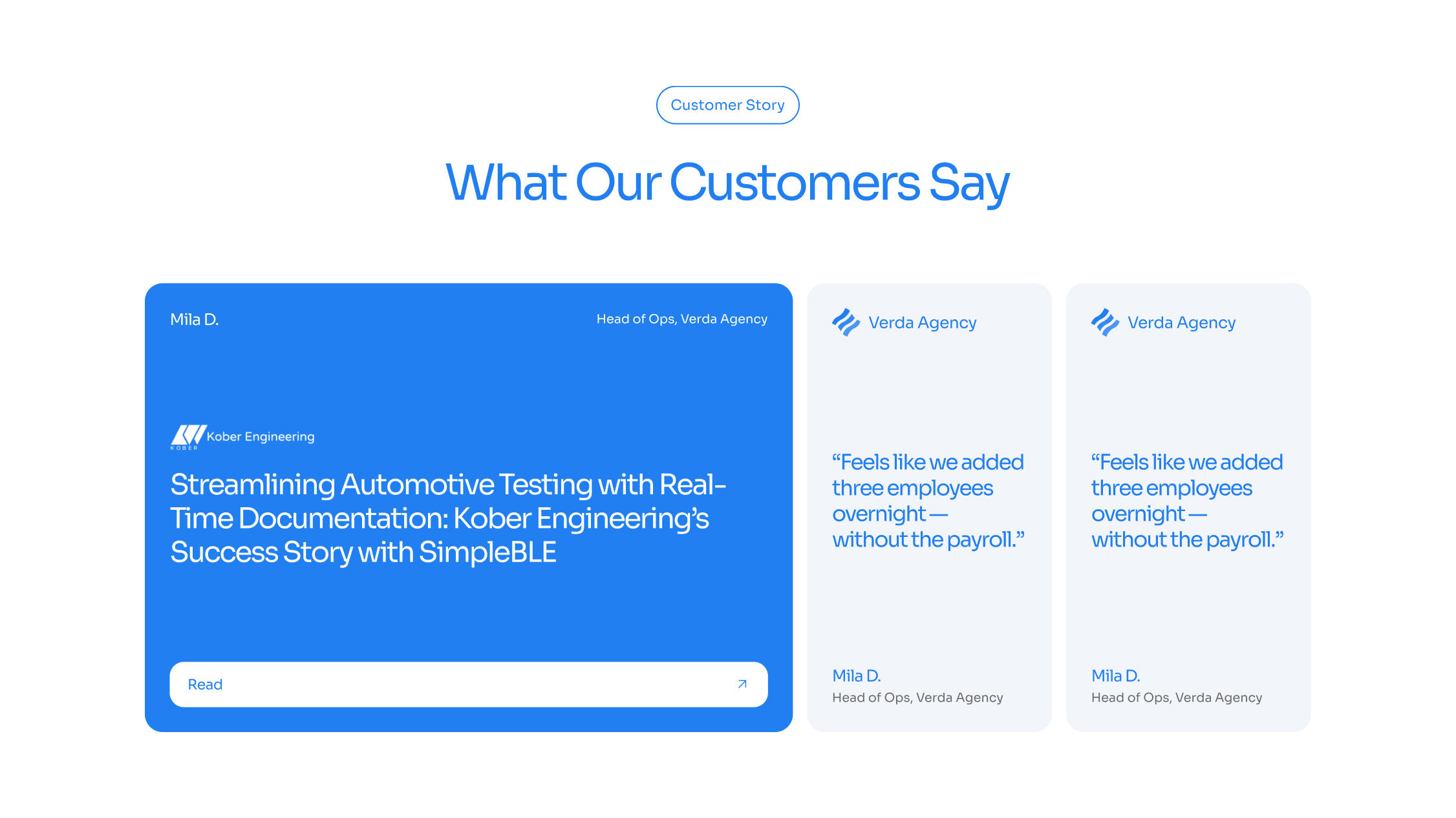
Elevated Customer Success Stories
Customer testimonials now appear prominently.
Enhanced Calls-to-Action
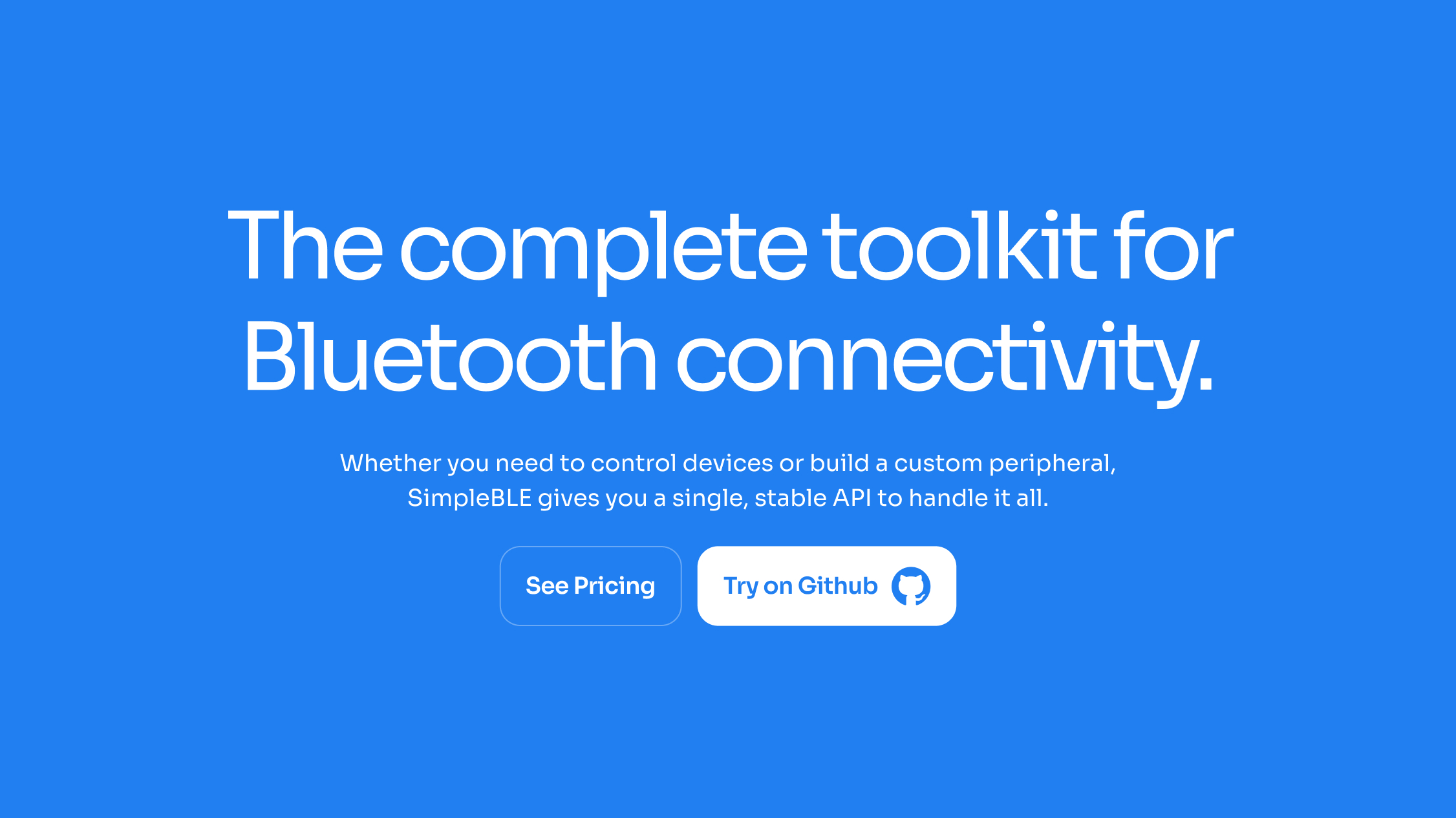
CTAs are strategically placed throughout to accommodate different visitor intents: "Try on Github" for technical evaluators and "See Pricing" for decision-makers.
